FUKUSHIMA NUCLEAR RADIATION MAP
2012, Rama Hoetzlein
| 2012. Hoetzlein, R. Visual Communication in Times of Crisis: The Fukushima Nuclear Accident. Leonardo Journal of Arts, Science and Technology. Volume 45, Number 2, pp 113-118. April 2012. |
Abstract
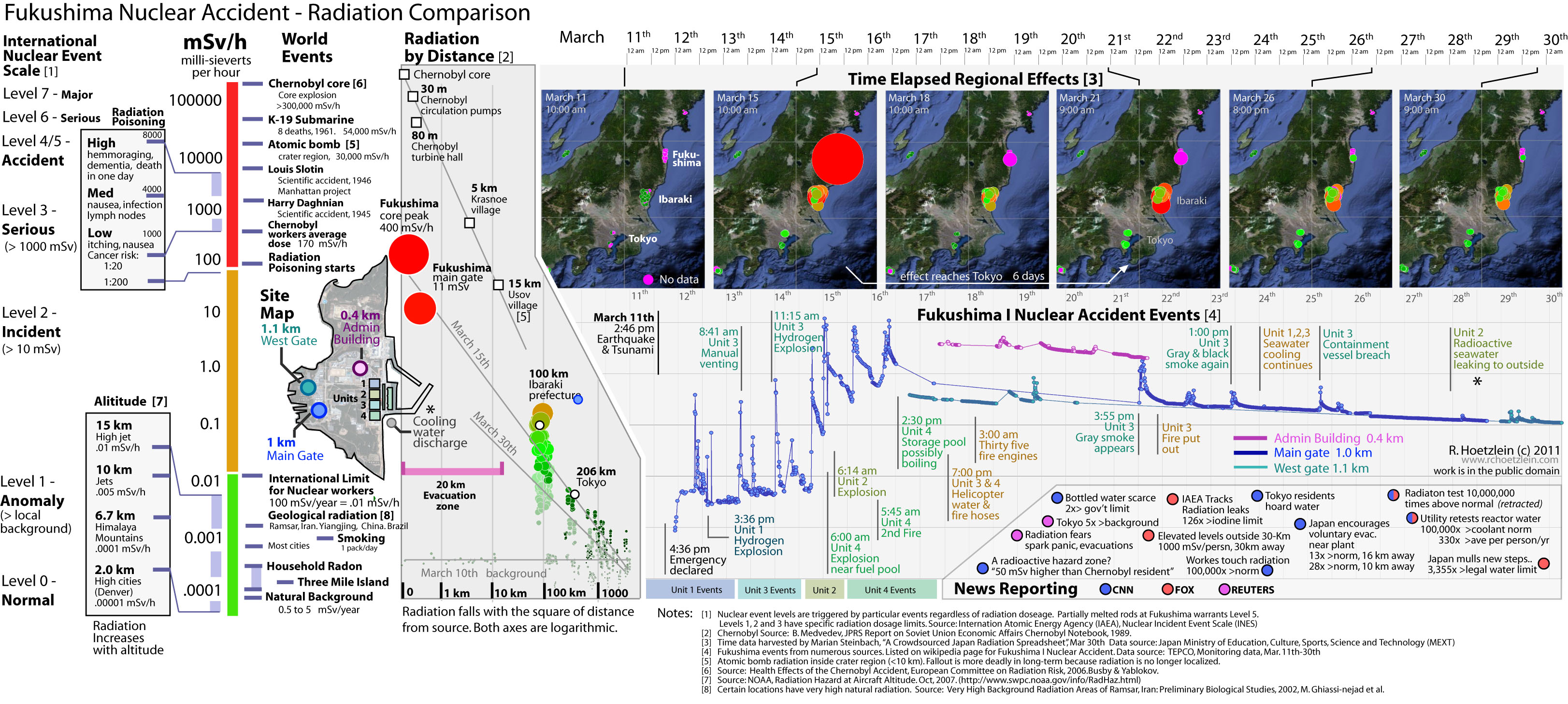
The Fukushima Radiation Comparison Map shows several aspects of the 2011 Fukushima nuclear disaster during the first few weeks that events unfolded. Based on radiation data available from MEXT (Ministry of Education, Culture, Sports, Science and Technology in Japan), the map shows radiation levels at the site during a two week period from March 11th to March 30th, 2011. Key accident events are mapped with correlation to live radiation data (bottom right). Comparisons to other major historic nuclear accidents are all mapped according to common scale in mSv/h, millisieverts per hour (left side).
Ibaraki Prefecture Animation
This work follows the development of visual communication through information visualization in the wake of the Fukushima nuclear accident in Japan. While information aesthetics are often applied to large data sets retrospectively, the author developed new works concurrently with an ongoing crisis to examine the impact and social aspects of visual communication while events continued to unfold. The resulting work, Fukushima Nculear Accident – Radiation Comparison Map, is a reflection of rapidly acquired data, collaborative on-line analysis and reflective criticism of contemporary news media, resolved into a coherent picture through the participation of an on-line community.
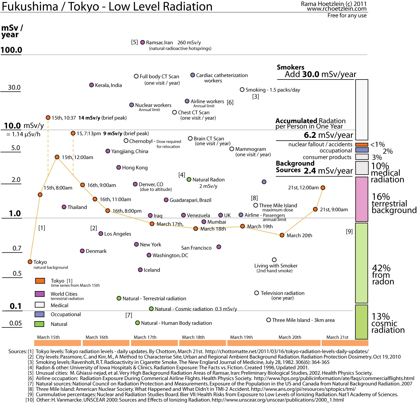
Tokyo Low-Level Radiation
This scatter plot shows the levels of radiation recorded by Geiger-counter in Tokyo over 7 days from March 15th to 21st. These values are compared with terrestrial background radiation in other cities in the world. Note, for example, that some cities such as Yiangjing, China emit 5.0 mSv/year naturally. Certain unique places such as Ramsar, Iran emit 260 mSv/year due to natural radioactive hotsprings. Also shown are radiation levels due to cosmic background, radon, and medical uses. Radiation is cummulative, and the average annual radiation per person in the US is 6.4 mSv/year. 42% of this radiation comes from natural radon in the air. 10% comes from medical radiation. Typically, a single visit for a Chest X-ray, or CT Scan can provide the total budget of medical radiation for a whole year. CT Scans are considerably more radiant, giving off 18 mSv/dose for a Chest CT, and 40 mSv/dose for a Full body CT, whereas a normal X-ray is 0.06 mSv/dose. Smoking is a major contributor to annual radiation, adding 30 mSv/year when smoking 1.5 packs per day. This is significantly above the 6.4 mSv/year typically received for one per person. A television emits slightly above the natural background radiation.
The result of these findings is that direct radiation emitted from Fukushima presented no cause for concern. A level of at least 10 mSv/year would need to be sustained — for the whole year — to make it a significant contribution to our annual radiation intake. Values in Tokyo currently average around what is typical in Denver, Colorado. Hence, elevated concern due to direct radiation is not warranted at this time.
The maps above examine direct electromagnetic radiation and particulate scattering in the air during the time of the events in 2011. They do not address consumption of radioactive particles by fish and animals, absorption by soil, and dispersion of radioactive waste water in the Pacific ocean. These later processes may contribution much more significantly to the long term effects of the Fukushima accident.
Although I agree with those that have been suggesting means by which to avoid siniifgcant exposure to radiation, I am highly critical of the way the media have exploited peoples already high levels of anxiety by further raising the fear level in people, effectively causing a global panic amongst western nations regarding nuclear power and radiation. I’m not a scientist or a student studying such matters, but I think if all of us took the time to look outside of the media everyone would discover that the media has overblown this situation. It is wonderful that the world has come together to help the people of Japan, but it is also extremely unfortunate that the media and governments the across the globe have effectively raised the levels of fear and anxiety, which have been blown out of proportion. When Gregory Jaczko announced before Congress that the government in Tokyo is not trustworthy, and Washington is, has left the world in a rather idiotic panic, scrambling for potassium iodide even in Miami. It is also unfortunate that Washington should discredit the Japanese governments 30km evacuation zone, by suggesting an 80km evacuation zone. Radiation levels in Tokyo are far below potentially hazardous levels (levels at which SOME people may experience nausea and headaches), and are lower than they would be in high elevation cities like Denver, or even Paris. In Tokyo radiation levels are below .20 microsieverts, while in a city like Denver radiation levels can be between .45 and .70 microsieverts. Radiation levels in a city like Chicago or Paris can be as high as .40 microsieverts. In other words its harmless. Even in areas just outside the 30km evacuation zone, radiation levels are siniifgcantly below potentially health effecting levels at below 5 microsieverts, which amounts to 50 banana’s. If you live in the middle of a banana plantation you are exposed to more radiation, in other words, again, harmless. People who fly regularly are exposed to far higher levels of radiation, anywhere from 100 to 300 microsieverts, depending on the length of the flight. The levels of radiation within the 30km evacuation zone, although differing siniifgcantly by area, are as of now lower than what one would expect to be exposed to on a trans-pacific flight. Reports of levels of radiation that are hundreds of times higher than normal levels fail to report that the levels of radiation that begin to cause potential health hazards are 250,000 microsieverts. Which, when we compare to the highest levels of radiation outside of the immediate vicinity of the power plant, 90-105 microsieverts, we see that the current panic is baseless and has effectively caused an unnecessary panic of hoarding and unnecessary traffic congestion. The government evacuated people when levels were still well below harmful levels, and to further note, below levels one would experience from a trans-pacific flight. The government has been remarkably transparent throughout this incident, there are plenty of private online live geiger counters to see levels across the Kanto area to prove that. We must also remember that people like Gregory Jaczko, who have caused this unnecessary panic, have known political leanings against nuclear power. Jaczko is not neutral, and has more interest in exploding the situation by scaring the people with the worst-case scenarios and of apocalypse, by shouting Chernobyl; which is just disgusting. Then the media followed suit. The likes of CNN and Fox, have created a firestorm of panic, both unnecessary and dangerous. I’m not suggesting blindly following the Tokyo’s announcements, but on this occasion I think there is greater reason to believe that the government has been highly transparent. I ask those that are believing the announcements being made in Washington or Paris to evacuate areas up to 80km; why would you trust someone in Paris or Washington, who are not being fed immediate and accurate information from those at the plant this very minute, over those in Tokyo who are?
Jon,
There was a minor calculation error which was fixed above (0.000001 mSv had too many zeros). It is now correct above. The overall argument is still valid.
Here’s why:
When someone says “1000 mSv/hr for 1 nanohour”, or alternatively “60 miles/hr for 1 minute”, what they mean is a rate during a duration of time. We can use the D = ST formula (distance-speed-time) as follows:
distance = speed * time (or..)
dose = dose rate * time
This gives us:
60 miles/hour * 1 minute = 1 mile
1000 mSv/hour * 1 nanohour = 0.000001 mSv
In both cases, the time units must be properly converted to allow for the multiplication.
However, your comment helps me to understand that what the chart shows — what was calculated — is effective dose, or mSv, and not dose rate (mSv/hour). Although the chart says mSv/hour, what this means is, take some dose rate (background, CT scan, brief spike), assume you receive it over 1 hour of time, what is the effective dose. I’ll fix the unit description in the map ASAP.
The calculation from 1000 mSv/hour over 1 nanohour into 0.000001 mSv is still correct.
RC Your explanation of your values on 9 April is in error. That’s like saying if you went 60 miles/hr for 1 minute you are really going 60 miles/minute and then your conversion multiplies instead of dividing which in this case would be like saying 60 miles/minute * 1/60 hr/minute = 1 mile/hr. i.e. this some how says 60 miles/hr for 1 minute is really 1 mile/hr.
Yes, you are welcome to use the graphic for any use.
To provide a caption or citation, here is the preferred way:
Hoetzlein, R. Fukushima Radiation – Comparison Map. Created by R.Hoetzlein, March 2011. Image is in the Public Domain. Retrieved from: http://www.rchoetzlein.com/theory
I am writing to ask for your permission to use the March 30 Radiation Comparison graphic for my thesis. I’m a radiologist and writing a thesis of Fukushima nuclear accident. I’ll post the thesis on The 70th annual meeting of Japan Radiological Society website.( http://www.secretariat.ne.jp/jrs70/)
The Japan Radiological Society is an organization of radiological professionals and this website makes pertinent information sharing for our members.
Congratulations – that is just about the most information-dense yet readable presentation of complex information I’ve seen in a long time. If only the newspapers were capable of treating us to such informative works of art, rather than just pretty graphics, we would all be better informed. I’ve been looking at it for over 10 minutes and am still getting new information from it. Superb!
Jay, while some of what you say is true (radiation is at least somewhat cumulative, etc.), you are also making mountains out of mole hills with your massive amount of paranoia about Fukushima.
1) Chernobyl released WAY WAY WAY more radiation (see graphs) and GREATLY affected large populated areas of the USSR (Russia/Ukraine).
2) Compared to the ridiculous number of atmospheric tests of nuclear weapons in the 40s, 50s, and 60s (and the two bombings of Hiroshima and Nagasaki), Fukushima is again quite tiny.
It’s not to say that Fukushima isn’t serious, because it is very serious, it’s just not the end of the world.
Also, if you look at the charts that the author so kindly put together at the top of the page, you will notice that most people recieve < 1/100,000 of the amount that they would need to get cancer from radiation. You are MUCH more likely to get cancer from bad genes (ex. BRCA1, BRCA2), exposure to chemicals (ex. benzene, smoking), birth defects, and viral attack (ex. HPV). Unless you lived near Chernobyl, Nagasaki, Hiroshima, Goiânia, or near some other nuclear blast or worked in a nuclear cleared facility or have been treated with nuclear medicine, you are VERY unlikely to suffer from radiation poisoning before you die from something else (like heart disease or nonradiation induced cancer).
Let’s not forget that the effects of radiation are in fact cumulative both in the atmosphere and in the human body. Most of us are sitting on the edge of radiation poisoning, even without Fukushima as evidenced by overbooked oncology clinics filled with those who are not long for this world and cancer statistics through the roof. Fukushima will not be recovered or diminished in effect before it has so poisoned the Northern Hemisphere that it becomes unlivable. Even tiny doses of radiation from a nuclear reactor are extremely dangerous. But North America is getting far more than just a tiny dose and we are being lied to even about that.
I tried a map in which I did that. But the correlations don’t appear very clearly because of the extreme timescales involved, i.e. nano-sec, hour, year. There are no intermediate measures for say 1 mSv/8 months, so the data just falls into three dense columns which is hard to see.
Regarding the 1000 mSv/h for a nano-hour you mention, this is resolved in the map as follows. What you’re really saying is 1000 mSv per nanohour. This is not equal to 1000 mSv/h, but must be converted to mSv/h to be correct.. So, it would correctly appear in the map as: 0.000001 mSv (10^3 mSv/nanohour * 10^-9 nanohour/hour). This kind of conversion was done for all values in the graph. So although dose rate is not shown, it does correctly report different dose-level-durations. ** UPDATE: See new comments below.
Be nice if you could fix the error concerning radiation exposure. The chart confuses the rate of exposure versus total exposure. Apart from acute effects (massive cell death), only the latter matters long term (eg for cancer, genetic damage). If I were exposed to 1000 millisieverts/hour for a nano-hour, little harm would come to me — a millionth of a millisievert (gamma ray equivalent of adsorbed ionizing radiation) — which adds little to my annual background adsorption of 3 millisieverts per year. The total exposure limit for Fukushima workers was reset without any basis by Tepco from the international standard of 100 to 250 millisieverts in a year. One way of fixing this is to have a second column showing the number of hours at a given millisievert level that would suffice on an annual basis to reach 100 millisieverts. Thus 100 mSv on the existing column would line up with 1 hour on the yearly doseage allowance.
Wow. Just shows what can be accomplished with a combination of an accomplished graphic artist who also has an obvious sideline in science.
Almost too much information; like that mapper who detailed Napolian’s retreat from Moskow.
Permission granted. Actually, you don’t need my permission as this is in the public domain, but thanks for asking. Please feel free to use in whatever way you like. I’m glad that it will be used by the Health Physics Society.
Rama Hoetzlein
I would like your permission to post the March 30 Radiation Comparison graphic on the Health Physics Society website (www.hps.org). The Health Physic Society is an organization of radiation safety professionals and our website attempts to bring pertinent radiation safety information of this sort to the attention of our members and the public.
Thanks for your prompt consideration of this request.
Howard Dickson
Web Operations Editor-in-Chief
925.382.3761
Thanks, submandave. Although I’m no expert, I did what I could to convey differences between time and distance. Showing the difference between dose rate and dose was more difficult. I tried some plots with dose rate on x-axis, and dose on y-axis, but those seemed less clear. In the end, while some media reports mixed them all up, I decided to standardize all rates to mSv/hour even though a high, short dose is still different from a low, long one. I did my best with this map, while the concepts of time-distance-shielding are not easily conveyed. I’ve learned more about radiation myself this past three weeks than ever I thought possible. As with anything, experience is the best way to get to know something.
(Note to readers: The US EPA defines safety guidelines for nuclear workers based on time-distance-shielding, which can be found here, http://www.epa.gov/rpdweb00/understand/protection_basics.html)
Well done. As a former nuke worker I appreciate your efforts to accurately present a bad situation with proper perspective and scale. I, too, got sick and tire of all the “1000X normal” reports with noone either saying what “normal” was or comparing the levels in terms the public would understand.
WRT your vertical axis, it seems you sometimes conflate dose rate with dose. For example, while the LD50/30 dose of ~ 4Sv must be received acutely to have this effect, it may be received over a period longer or shorter than an hour, depending upon the local dose rate. People should understand that old mantra of “time-distance-shielding” and how total dose depends not only upon rate but stay-time.
Thanks. The size and color of circles both represent mSv/hour, and correspond with the values on the large vertical bar to the left. The whole map is based on this unit of measure for radiation.
The geographic maps tell how radiation has changed at different locations across Japan over time. I am hoping to make a video, since there is a lot more data than you’re seeing here. But these maps do show how the radiation is carried in the air over time to nearby towns and cities.
Wow, that chart is amazing!
It is also becoming very colorful and I sometimes have to pay attention not to get lost between the different associations of e.g. blue.
How do size and color of the circles correlate? Are these two dimensions (size, color) for one value (Sv) ?
What do me the maps on top tell?
Again, this is a great work and a fabulous data visualization example.
Thanks
Your new chart is very informative. Many thanks!
And I especially agree with a comment you wrote in your blog: “How have we arrived at a point where news reporting celebrities with no real knowledge have the right to openly defy independent experts?”
I have completely given up on mainstream news sources except as a source of humor or irony 🙁
-Craig
I am pleased to announce that a new, updated map and commentary are provided above!
Please see the updated text above for a more detailed look at what the new map shows.
Thanks to the support of readers for providing suggestions and links to data.
(High resolution versions can be provide, if desired, as the zoomed jpg map above was posted through WordPress which only allows uploads <2 MB.)
Aaah, great! How about an SVG-version? Smaller file size and as a vector file format the image would be scaleable while retaining perfect antialiasing
Brilliant & Creative!!
I have seldom seen data presented in such a clear and succinct manner!
PLEASE create an update to include later dates, especially now since it appears one of the containment vessels may have been breached.
I found a source that said the average lifetime cancer risk is 1:25. I can’t seem to locate the source now, but I’m going to take this out in the next version anyway, as cancer risk is so variable.
The visual design tools were Photoshop and Adobe Illustrator, with most of the graphic design taking place in the latter. A Perl script was used to parse the data, and MS Excel for the plot.
I look forward to having an updated map by next week.
Great job. An excellent example of data visualization.
A question: what do you mean with "normal cancer risk from other sources", and why it is higher?
And: what tools did you use?
I’d like to include distances levels for Three Mile Island, but the only value I was able to find is 1 mSv/year as the maximum dose. If you know of any reliable sources of data for Three Mile Island radiation at several different distances, I’d be happy to include it (at least 3 for a distance line). I think such data may be hard to come by because the levels are so low.
Could you add something about 3MileIsland in your chart? I think it would be great in the dose vs distance segment.
Thanks for all the feedback!
Due to all the responses I’ve gotten, I’ve decided to work on an updated map. Hope to have something in a few days. I will post it here and on wikipedia when finished.
-R
Please update with an extended timeline! Thank you for your efforts to communicate the risks in a way understandable to the general populace. I hope you might also indicate other incidents with human impacts familiar to a general audience such as the radiation exposure for the unfortunate Tokaimura workers and lighter exposures, such as those US army personel present at Trinity and other pacific or other A-bomb tests — in these cases with the ratio of increased cancer risk, if statistically known.
Thank you for your work and communication.
Where you wrote “resulted in a voluntary evaluation of the surrounding area”, should that be “voluntary evacuation”?
in the radiation effects section i think you meant to write “dementia”
its a fantastic graph btw, though I guess I prefer pictures of a hand-drawn mercury redstone rocket
This is one of the best, most informative graphics I’ve seen. Very comprehensive!
Thanks for creating and sharing this chrat.
Best wishes.
Jim Pritchard (Engineer)
Chapman, Maine.
NIce, updated data from Fukushima are available at the German GRS (a German Association for Nuclear Safety)
there is a nice plot
http://www.grs.de/sites/default/files/Radiation-Data__20110325-1000_daiichi.pdf
and various updated stuff (but only in German) http://www.grs.de/informationen-zur-lage-den-japanischen-kernkraftwerken-fukushima-onagawa-und-tokai
Thanks.. A link is easiest. I will take a look at these when I have a chance. If its not too much (<5 MB) you can send by e-mail also: rch@umail.ucsb.edu
-Rama
Perhaps here? Also has a nice overview of sensor-placement:
http://www.flutrackers.com/forum/showthread.php?t=164511
How to send you data sources without using this comments area?
Hi Rama,
Enjoyed the reading. There is data available from this website:
http://park18.wakwak.com/~weather/geiger_archives.html. the FAQ is in english. I have been monitoring the data on a daily basis from Tokyo. Based on Mr Ishikawa information, we stand roughly at 1.6mSv/year over the past week.
FM
Thanks to everyone for the comments. I have been teaching classes this past week, so I apologize for not having updated the data yet.
If anyone has links to the recent data, up through the present date, please send me a link and I will incorporate new data asap.
Thanks -Rama
A really great and informative chart! Thank you.
I have a little finding on the “by distance”-graph. The data points are not placed correctly on the x-axis, see “20km Fukushma zone” being on the left side of the “10 km” mark, rather than a little to the right.
Also the sheet has been updated on 17th the last time. this is now a whole week ago. Could you pleeeease update it again to reflect the lastest (manipulated official) readings? Thanks!
My compliments on a highly informative chart.
Check the units on the Hokota city map. If those are nano-sieverts/hour, then its probably correct. It may also be correct with micro-sieverts/hour. It is definitely not milli-sieverts/hour, which is shown in the graph above.
awesome figure, really makes you want to see those line plots going down again.
I ran across this link and am wondering if these measurements are incorrect?
For example, 715.4 nSv/h at 22.03.2011 9:27 pm Momiyama Hokota City, Prefecture of Ibaraki
http://hisz.rsoe.hu/alertmap/nstc.php
The link appears to be coming from the RSOE Emergency and Disaster Information Service
website in Budaphest, Hungary:
http://hisz.rsoe.hu/alertmap/index2.php
Thanks. I just did another one here on Tokyo low level radiation, data up to March 21st:
http://www.rchoetzlein.com/theory/?p=187
This chart is fantastic. I hope you have time to update it. Putting it all into a meaningful perspective is important and almost impossible given how the press glosses over the details.
Very impressive. I hope you manage to get the data for later dates into this graph to show the progression of the emergency situation. I’ve been on Wikipedia and various news sites daily since this started, and as a scientist the dearth of hard information has been really frustrating.
Yep, you’re right. Thanks for the observation. I found a chart of altitude that indicated micro-sieverts, not milli-sieverts. I’ll change the numbers asap. I’m interested in the data you speak of. Will contact you over on wikipedia.
Hi, RC. I like your graph. I made the previous version that yours replaced; I can send you the data for later times if you’re interested. However, I think there’s a mistake in your calculation of radiation at high altitude. My impression is that the radiation in a jet is about 20x background. Even astronauts in the ISS only take about 100x background. Perhaps you’ve substituted a milli where you meant micro? You can respond on my Wikipedia talk page if you like (the e-mail is rarely checked).
You may want to update with material from http://www.tepco.co.jp/nu/monitoring/index-j.html